CALIFORNIA STATE UNIVERSITY SAN MARCOS
Project Goals
Establish Comprehensive Brand Guidelines
At California State University San Marcos, I demonstrated exceptional leadership by establishing comprehensive brand guidelines and managing a team of 10+ campus photographers. I created systematic processes for brand consistency, developed training programs for new photographers, and unified visual style across all university communications and organizations.
Services
Logo & Brand Standards / Color & Typography / Original Stock Photo Library / Mascot Redesign / Reimagined Athletics Uniforms & Competition Facilities
The project required cross-functional collaboration with athletics, communications, alumni association, philanthropy, and other administrative departments. I successfully managed the complete mascot redesign, coordinated uniform updates across all sports teams, and implemented campus-wide signage systems. This leadership resulted in measurable increases in student pride, fan engagement, and alumni connection.
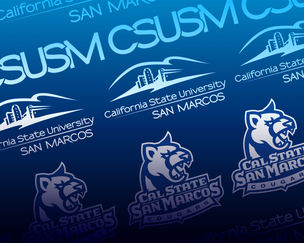
LOGOS & BRAND STANDARDS
The young campus of CSUSM needed guidelines to follow while using the university marks, so I established the following brand style guide. This style guide serves as a reference for all campus representatives creating publications or promotional materials.
I categorized the different marks used across campus by their respective target audiences. For instance, some core identities can be used for any audience, while sub-identities are specific to certain organizations embedded within the university. Our goal is to be a branded house, not a house of brands.
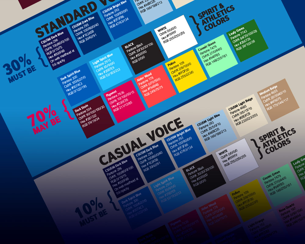
COLOR & TYPOGRAPHY
In addition to the official logo marks, color and typography are key in establishing a branded identity. The following guidelines support media makers in the Communications Office. I published an online, detailed chart of the university’s colors and links to download fonts to help guide the campus community while building their media.
Because the official colors are shades of blue, one challenge while establishing an official palette was to include complementary or secondary colors that would add life to a piece of media without straying too far from the established brand. I broke down the different palettes by voice. The university employs the “official voice” (a more restrictive color palette) for public-facing media. In contrast, the “casual voice” (a more liberal range of colors) is used to communicate with on-campus audiences.

CAMPUS PHOTO LIBRARY
Beyond the logos, colors, and fonts used in CSUSM’s brand style guide lie the emotions, memories, and perceptions people have about the university. There is no more accurate way to communicate those moments than through photography. A key part of strengthening the brand of CSUSM was building a photo library that the campus can share.
My focus was to unify the photo style across a team of over 10 photographers and train incoming photographers to shoot with a specific quality and aesthetic that features the university’s strengths. We always aim to communicate our core values and mission statement. Whether shooting live events or directing student models, my goal is to capture images that genuinely reflect the diversity, accessibility, positive energy, and pioneering spirit that the campus community shares.
MASCOT REDESIGN
The “makeover” of CSUSM’s beloved mascot, Crash, was a passion project of mine. The First-Generation Crash was a generic lion costume that anyone could purchase on Amazon. As a creative tasked with building the brand, it was painful to watch the docile and sometimes ragged-looking lion costume stumble around at campus events and basketball games. I researched various mascot creation companies and explored what Crash could and should look like. He should have claws, teeth, and muscles! Trained gymnastic athletes should wear it. He should represent CSUSM with the bright “cougar blue” (a phrase I am proud has become a part of the vocabulary of students, staff, faculty, and alumni). Seeing Crash strengthened by his new identity was a huge win for the branding of CSUSM and the entire university.

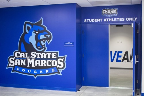
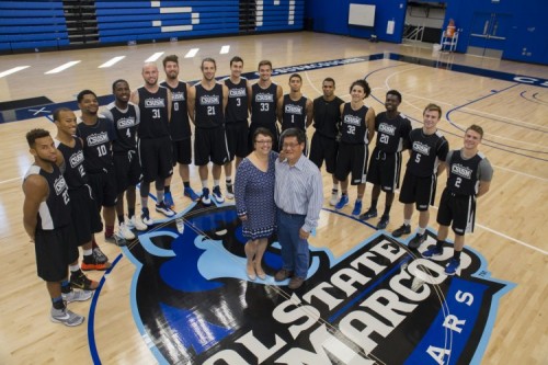
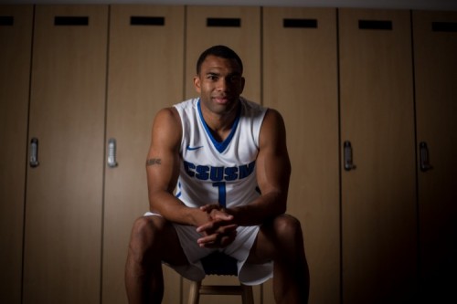
REIMAGINED ATHLETICS UNIFORMS & COMPETITION FACILITIES
The refreshed brand extended its reach to the Athletics department. The various teams finally achieving the long-sought-after NCAA classification ushered in a new era of fan enthusiasm for the Cougars. The spirit team that led fans through chants and songs appropriately named themselves the “Blue Crew.” We stocked the bookstore with great swag for fans and ensured that each of the sports uniforms and training facilities aligned to represent CSUSM unmistakably. The number of sports fans multiplied in the following years, and their pride is palpable!

